

When journalists read academic studies, whatever the subject — the relationship between wages and well-being, the effectiveness of flu vaccines or the benefits of political incumbency — they frequently encounter the term “regression,” a mathematical tool for establishing the relationship between two or more variables. The technique is well known to data journalists, but even savvy reporters may feel a measure of discomfort when they come across it — they seldom have the expertise or time needed to understand advanced mathematics or dig into a study’s original methods and data. Still, there’s a lot to be said for getting more familiar with this somewhat obscure yet ubiquitous form of data analysis.
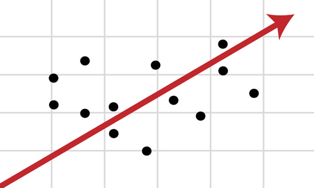
Simply put, regression analysis is a way to determine if there is or isn’t a correlation between two (or more) variables and how strong any correlation may be. At its most basic, this involves plotting data points on a X (horizontal) and Y (vertical) axes — for example, car weight and crash fatality rates — and looking for a trend line and, potentially, a relationship. You can do this visually, just by eyeballing the data, but it can be done with much greater accuracy and certainty by using a spreadsheet application such as Excel. Fortunately, this and other data-analysis programs come with the necessary tools built in, and it’s just a matter of your getting access to the numbers, and then properly using the program.
A basic example to use for creating a regression is mortgage rates and housing prices. Anyone who’s ever had a meeting with a bank loan officer knows that as interest rates rise, mortgages become more expensive and thus the maximum mortgage that one can afford declines. In response to this, median housing prices frequently decline. (For the sake of simplicity, we’ll leave aside the “unconventional” mortgages that contributed to the housing boom and bust.) But what exactly is that relationship between mortgage rates and median house prices? If mortgage interest rates increase by 1 percentage point, how much would the median selling price of properties fall?
To answer this question, you need some data and a spreadsheet program. We’ll use Microsoft Excel in our example, but free tools such as Open Office Calc have similar capabilities. The data is courtesy of Sudhakar Raju of Rockhurst University.
————–
First, verify that Excel is set up to calculate regressions. If your computer is a PC, it must have the Analysis ToolPak enabled:
- Click on Excel logo at the top left-hand corner of your screen or go to the File menu.
- Click on Options.
- Click on Add-Ins.
- Select Analysis ToolPak.
- Click the Go button.
- In the Add-Ins dialog box, ensure that “Analysis ToolPak” is checked.
- Click OK.
For Macintosh computers using Excel 2011 and 2008, you need to use external utility called StatPlus that provides similar capabilities to the Analysis ToolPak.
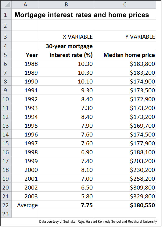
Here’s the data we’re going to use. It’s a list of the average interest rates on 30-year mortgages and the median home selling price from 1988 to 2003. We want to put the home prices on the vertical (Y) axis and the interest rate on the horizontal (X) axis. An Excel spreadsheet with this data in place can be downloaded under the “related resources” heading at the upper right of your screen.
Now create a diagram of the data points — this is known as a “scatter plot” — with a regression line that shows the relationship between mortgage interest rates and median home prices:
- Download the spreadsheet and open it with Excel. Ensure that you’re on the first tab, “Interest rates and home prices.”
- With your cursor, select the range from cells B6 to C21 (note that we don’t want to plot the averages, which are on line 22).
- Click on Insert and then Scatter. Excel will generate a scatter chart and place it on your worksheet.
- On the scatter chart, right-click on any point in the chart.
- Choose “Add Trend Line.”
- Select “Linear,” “Display Equation on Chart” and “R-Squared Value on Chart.”
When you press OK, you should see the following chart, or something similar:
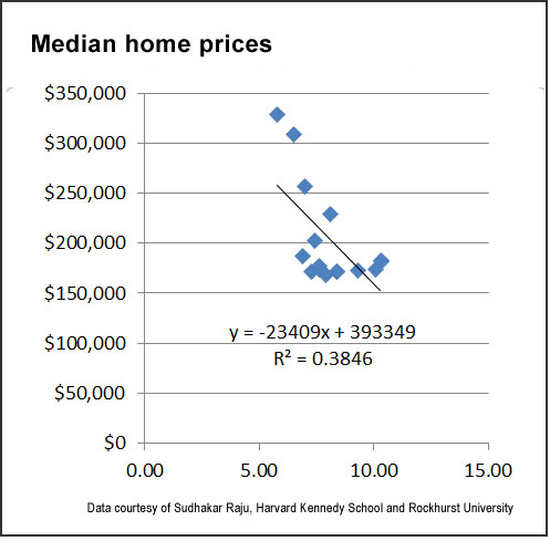
What is being shown in the graph is the regression line, which is a “trend line” revealed by analysis of the data points. While correlation isn’t necessarily causation — there could be other factors involved that are not being taking into account — you can see that as interest rates increase (moving to the right on the horizontal scale), median home prices decrease (moving down on the vertical scale). In this case, the interest rate is the independent variable and housing prices are the dependent variable: interest rates drive housing prices, not the other way around.
While the regression formula looks complicated — “y = -23409x + 393349” — it’s actually not too hard to read and use. The formula’s end result is a Y value, which will be a median home price; this is influenced by the X value, which is the interest rate: For any 1 percentage-point increase in interest rates, the median value of homes sold decreases by $23,409, and vice-versa. To give an obvious example, if interest rates are zero, the X in the formula is zero; this would completely eliminate the $23,409 multiplier (also known as a coefficient), and the median home price would be $393,349 (this is known as the Y-intercept). If the average interest rate were 10%, then the median sales price would be $159,259 — $393,349-($23,409*10). You can plug in other interest rates, and see what the median sales prices would be.
The “R-squared” value tells you how compelling the dataset is — and you can see this visually by how tightly the data points are or aren’t distributed around the trend line. Excel calculates R-squared for you based on the vertical distance of the individual data points from the trend line, and it’s always between 0 and 1: The higher the value, the better the “fit” of the data and the more accurate the formula. In our example, the R-squared is 0.3846 — decent, but not great. Consequently, we might want to get additional data to see if we can establish a stronger relationship (or not) between mortgage interest rates and home prices. Interpretations of R-squared values very much depend on context, and in some cases a lower value may still be satisfactory.
If you want to generate more exhaustive diagnostics, you can easily do this in Excel:
- Click on Data, “Data Analysis,” and then select “Regression.”
- In the Input Y Range, select C6:C21.
- In the Input X Range, select B6:B21.
- Under Output Options, choose “New Worksheet Ply,” then click OK.
The spreadsheet also includes a second set of data on the “transit demand” tab. It lists data for 27 cities, including weekly transit riders, transit cost per week, population, rider income and the cost of parking. If you got access to this data and wanted to better understand how the variables related to each other, what could you explore? One relationship would be between parking rates and transit ridership. Another would be the cost of transit and transit use — how sensitive are riders to price increases? You can use regression analysis to dig into the numbers, and see what comes out.
If you’d like to learn more about statistics, two additional resources are worth checking out: “Statistical Terms Used in Research Studies; A Primer for Media,” defines the key statistical concepts that journalists should be familiar with, including samples, variance, confidence levels, and more. An article from MIT’s news office, “Explained: Regression Analysis,” does an excellent job of explaining the basics of what regression is, and delves into how it’s calculated.
Keywords: training, mathematics, data journalism
Expert Commentary